Technicolor Trim
Virtual Fascia Improved.
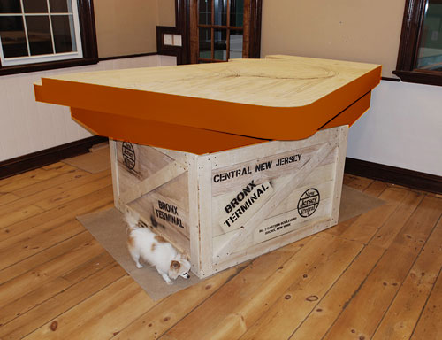
Apparently my Photoshop skills are a bit lacking as can be evidenced on the previous post where I coloured in the fascia on the layout rather haphazardly. Fortunately I was sent an updated version today by a modeler who is a bit more skilled at such things, he took the liberty to polish it up a bit. It is surprising how convincingly he did this. If I never actually show anyone the layout other than on the website I won’t need to build it at all…
Thanks Roger!
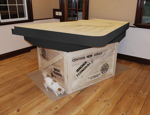
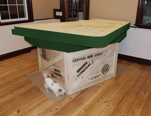
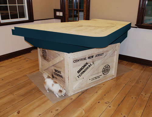
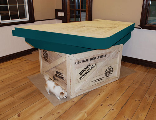
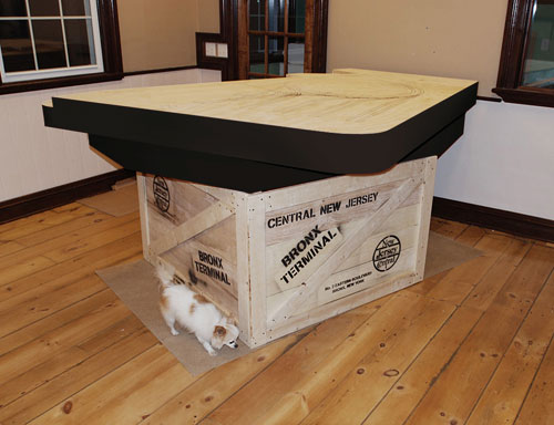
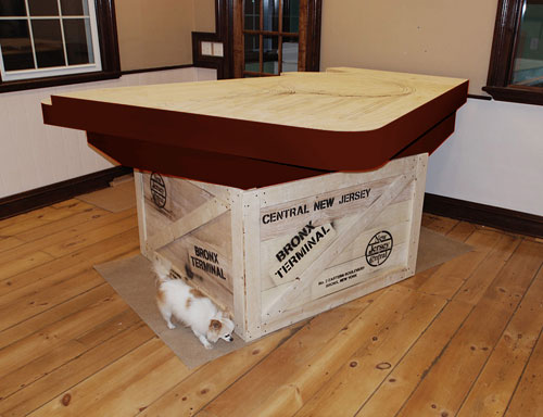
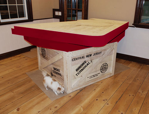
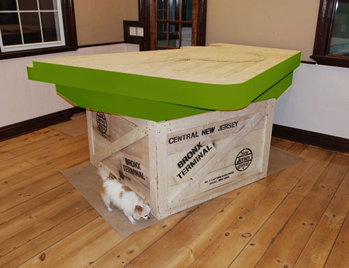
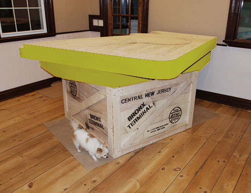
Since the fascia was so well done I thought I would experiment a bit with some colour variations. I initially was going to use black, but now I’m contemplating using a bit of colour instead. Still haven’t decided.
Here are a few samples…
Wow. Some of those are hideous. If you see any you like let me know.
On to Next Section
-T.
About the Author:
I'm your host, Tim Warris, a product developer in Port Dover, Ontario. Since March of 2007 I have been documenting the construction of the former CNJ Bronx Terminal in HO scale. For my day job, I design track building tools for Fast Tracks, a small company I own and operate. Fast Tracks makes it fast and easy to hand lay your own trackwork. Stop by our website to learn more!
Posted by: Tim | 03-30-2008 | 09:03 PM
Posted in: Benchwork Construction | Latest Posts

Tim,
I vote for the navy blue or maroon colors. both would set off the modeling nicely.
I love the faux crate. Excellent idea.
For what its worth, I like # 1, 5, & 6. I’d run scared from the day-glo greens, reds and oranges! Yikes! LOL!!!
Hey, great works! How about the orange one? Or perhaps the deep blue scheme matches the harbor water…
I think you should take the orange or the brown one… It would be cool if you painted it so it looked rusty. To get the right industry-feeling!
I’ve always liked Payne’s Grey, myself. It might work well with your water theme, too.
– Trevor
Tim,
I’m glad you are throwing this out for discussion. The fascia is the single largest concentration of color on most layouts and in many ways sets the ‘tone’. The fascia color should be supporting, but not overwhelming. I’ve seen a lot of layouts with woodgrain paneling on the fascia that is very distracting.
I think the grey or dark blue will work well for your Bronx Terminal layout. However, if you have a color on the layout that you want to ‘bring out’, you may consider using it for the fascia. For example, the Jersey Central has used various shades of green or blue through the years and you may want to choose one that is also used on your locos. Just a suggestion.
– Todd
I’m partial to the greens, although the deep blue I think would have an “elegant” feel to it. There is no chance for the day-glo versions, just threw those on.
I really like the suggestion of rust. I think I will experiment with that a bit, perhaps some rivets and raised lettering, all painted in a faux rust finish. Would give the layout a real industrial feel.
Good suggestion!
Tim, with the stepped fascia, you could possibly do a two tone paint job, with the upper and lower levels being complementory colors.
Red and Black perhaps!
Hey Tim – distress that crate – make it look a little shipped! Who says weathering has to be restricted to our miniatures…and isn’t that crate a model? (Or are you naturally going to beat it up? 😉
My vote is for #2 (dark-blue green) but I would make the bottom portion black – that would step the whole thing out and make it look sharp!
The reasoning behind the dark/blue green suggestion is that the Bronx terminal is “on the waterfront” – and you would somewhat give that impression with that deep-seawater color.
Great job – and excellent presentation!
Chris